
Do you judge a book by its cover? That is what we are doing in today’s post! This is something I do a few times a year where I look at new releases that have different covers for the US and the UK and decide which one I prefer. This is just for fun and I have found a ton of amazing illustrators this way. I have linked their instagrams and websites throughout the post, so check them out!
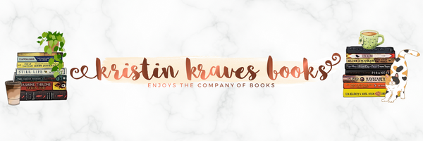
Tainted Cup
There is no denying that both of these covers are stunning and I have a feeling the US editions will be foiled and gorgeous in person, but my eye is immediately drawn to the UK cover. To be fair, Tom Roberts is the artist of the UK cover and he has quickly become one of my favourite illustrators. He also did the covers for The Book That Wouldn’t Burn and Godkiller. There is just something about his style that appeals to me! In the case of The Tainted Cup, I am particularly intrigued by the colour pallette on the UK cover! That pop of pink with the teals and purples of the mushrooms is somehow eerie in the best way. Also, apparently I am into books with mushrooms on the cover. It would be remiss not to point out the font and title placement on the US cover. I love that it is placed in a scroll and I also like the way the vines are creepy up the side. Obviously my personally favourite is the UK cover but I can totally understand why someone would go for the US edition!
My Winner: UK
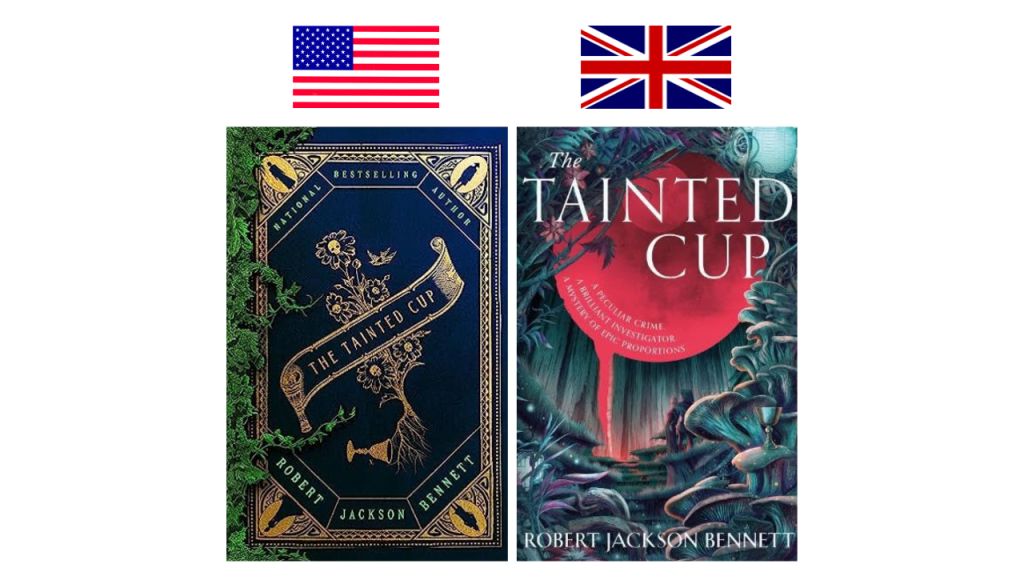
The Warm Hands of Ghosts
I think that the UK edition is beautiful and I love seeing the violin in the middle of the “o” in “ghosts” and I think the background is really pretty, but there is nothing unique about in in my opinion. It feels like I have seen different versions of this cover many times before. I like a lot of the design choices that were made for the US cover. That gold frame is really striking and draws your eye to the center and that poppy the woman is holding. As this is a war book and partly set in Canada, I know the significance of that poppy so it is really effective. It is so simple but somehow haunting. I also like the font and the use of red.
My Winner: US
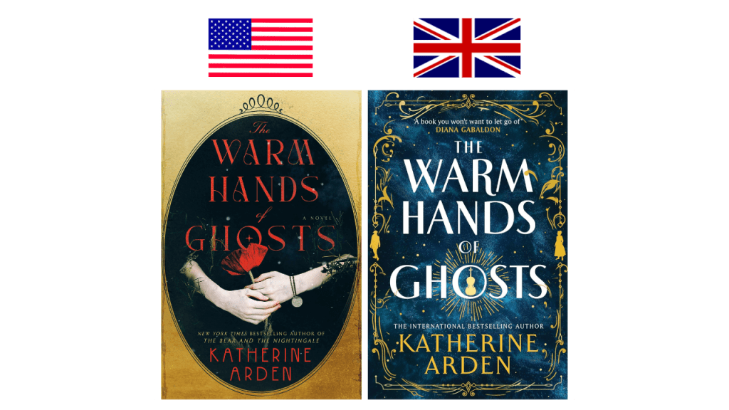
Compass and Blade
I always say this, but it is interesting as a Canadian to see which covers we end up getting! We typically get the US covers, but in this case we got the UK edition. I am torn on this one! I much prefer the font on the US cover. It is more stylistic and is giving fantasy. I also love that the cross through the “A” is a dagger. Very cool! The font on the UK version is fine but I find the colour choices distracted and it somehow takes away from the stunning illustration. It is illustrated by Nico Delort, who has a really interesting style. They are actually doing the illustrations for the illustrated edition of The Hunger Games coming out in October. As much as I like the UK illustration and have followed the artist on Instagram, my eye is more drawn to the US edition. I think it is because it is more whimsical and I prefer the colour choices.
My Winner: US
Someone You Can Build a Nest In
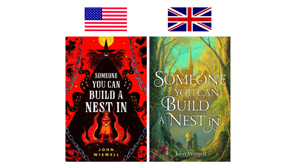
I have been thinking about these two covers ever since I discovered them, which was months ago! It is hard to believe that these covers are for the same story. The US edition is kind of scary and strange while the UK cover is giving me cozy fantasy and is so soft. Why do I love them both? This is one of those things where if I adore this book I could see myself ending up with both editions. James Fenner is the artist of the US cover and looking at their instagram you can tell this is very much their style and there is something just cool about their work. That witch’s face is super creepy and then there are those tentacles and chains and skulls but we also have hearts? Super intrigued! My cozy fantasy lover heart is definitely drawn to the UK cover. I just love how soft it is! I believe the artist is Stephen Player, who has done some work for Terry Pratchett books. Again, there are mushrooms so that appeals to me. I often say this in these posts, but I love when a cover has depth, which is the UK covers definitely has. I have to go with the UK cover in this case but it could be a situation where I read the book and find the US edition a better fit.
My Winner: UK
The Eyes are the Best Part

The UK cover is simple yet impactful, but how can it compete with the US cover and the eyeball with the chopsticks? There is something so horrifying about that imagery! I prefer the realistic eyeball on the US cover versus the more graphic one on the UK edition. I think that the US cover captures the horror vibes while the UK one feels more like literary fiction and that is probably just because it reminds me of some other covers I have seen within the genre.
My Winner: US
These Deathless Shores
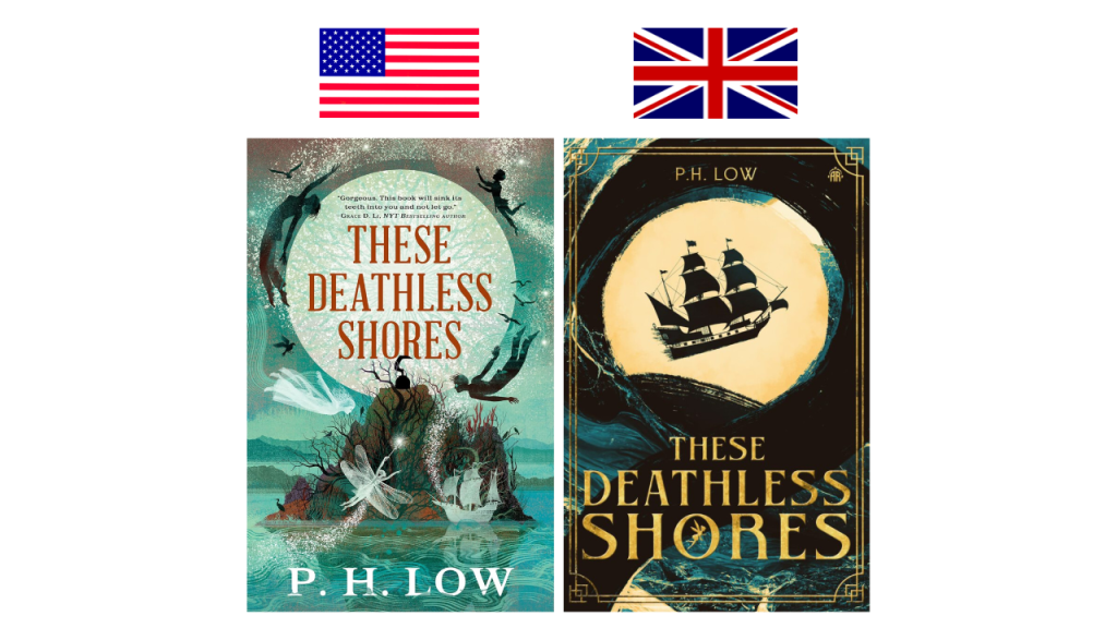
This is such a hard one! I have actually enjoyed work from both of these illustrators in the past, so it is no surprise that they both appeal to me. The Balbusso Twins are the illustrations for the US edition and they also did the illustrated edition of The Great Gatsby, which is one of my most prized possessions. It is gorgeous! Alice Claire Coleman illustrated the UK edition and she also did The Bone Roots and Evocations, which are two of my favourite covers. I think the US cover is more whimsical and it is definitely giving Peter Pan, which works because this is a Captain Hook origin story. The UK edition is more subtle in its Peter Pan references but that ship is pretty recognizable and Tinkerbell is in the “O” in “shores”. I am leaning more towards the US edition for the colour pallete, the whimsical vibe, and the Peter Pan references, but they are both amazing!
My Winner: US
The Night Ends With Fire

Victo Ngai illustrated the US cover and he also did Norse Mythology and Vicious and now that I know that I can see the similarities in style! I like the art style of this cover but I think it is in the colour palette that is stopping it from being my favourite. It is just too much orange and all of the details are lost. Mathias Ball illustrated the UK cover and, from what I can tell looking at their portfolio, they typically illustrated children’s novels, so maybe that is why this cover is more colourful. There is still a lot of orange, but the use of that teal colours and some highlights was smart because it breaks things up and it is easier to notice the details.
My Winner: UK
Queen B
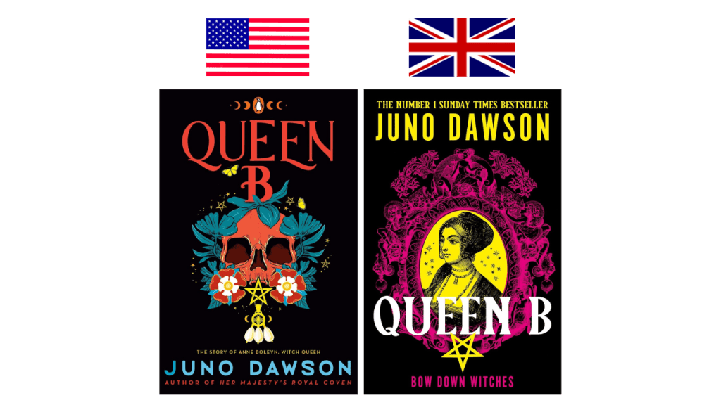
I tend to prefer Juno Dawson’s UK covers and Queen B is no exception! I actually didn’t realize that Queen B was a sequel in Dawson’s Her Majesty’s Royal Coven series but looking at the covers now it is pretty obvious. I like that both covers have a flat black background and it really makes the colours pop! The US cover is till cool and I like the skull and the imagery but there is no denying how cool the UK cover is. I love the way the yellow and pink looks together and knowing that this features Anne Boleyn, the UK cover just makes sense.
My Winner: UK
The Book Of Doors

It is interesting that the elements in both of these covers are similar but I much prefer the way they are executed on the UK edition! The style appeals to me more and I like that it is more obvious that the stairs are made of books. Without referencing the UK cover, I don’t think I would have noticed the stairs were made of books on the US edition. That said, I do like that the US cover has the character fall from the door!
My Winner: UK
How You Get the Girl

Hattie Windley is the illustrator of the US editions and I have always loved all of the covers within this series. I didn’t know that UK had different covers until I was researching for this video. I think the “O” in “How” being a basketball is a nice touch and the tagline is cute, but the US cover is my clear winner. I appreciate the details that went into creating these characters and they look exactly like I imagined them when reading the story.
My Winner: US
Lady Macbeth

Elizabeth Wakou illustrated the US edition and I am kind of in awe of the fact that this is a drawing. She was the perfect choice for this cover and the more I look at it, the more I love it. It is so haunting and effective and I need a copy of my shelves ASAP! I also love that the title is in hot pink. I think that this is going to be a divisive cover and I can totally see why someone would prefer the UK edition. There are so many great elements but I especially love that the character’s braids are dipped in blood! However, the US cover is one of my favourites of 2024 so it was tough competition.
My Winner: US
Murder Road
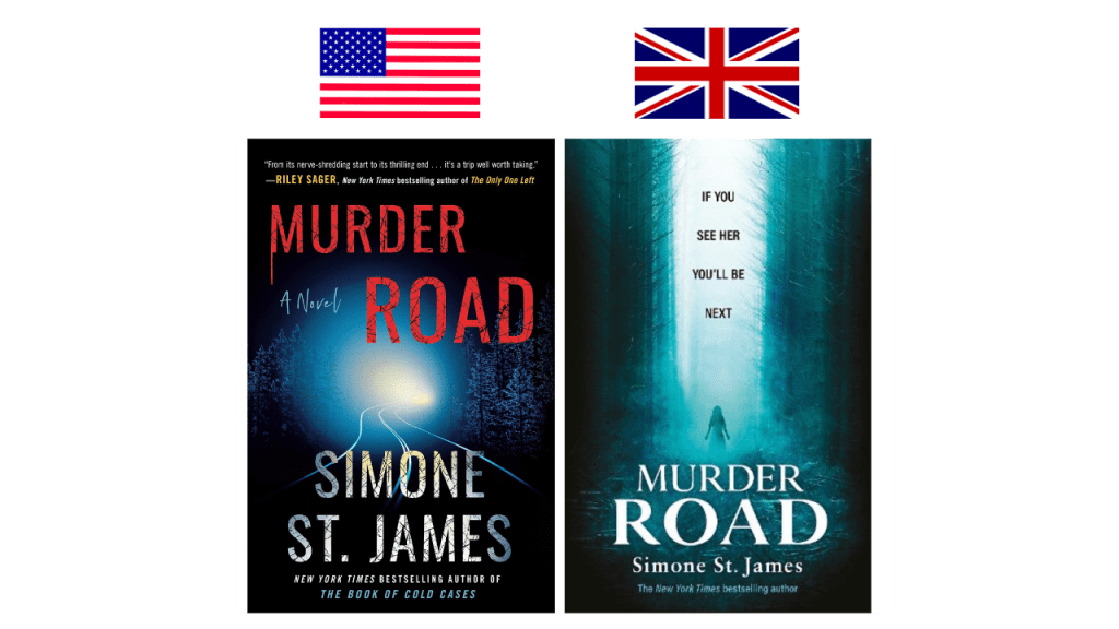
I had not include a few thrillers/horror novels on this list! I adore Simone St. James, but neither of these covers wow me. I actually think they give different vibes! The US edition looks like a thriller while the UK one screams horror to me. I am more drawn to the US edition simply because of the red font and I think it does a better job of telling us what the story is about!
My Winner: US
How to Solve Your Own Murder
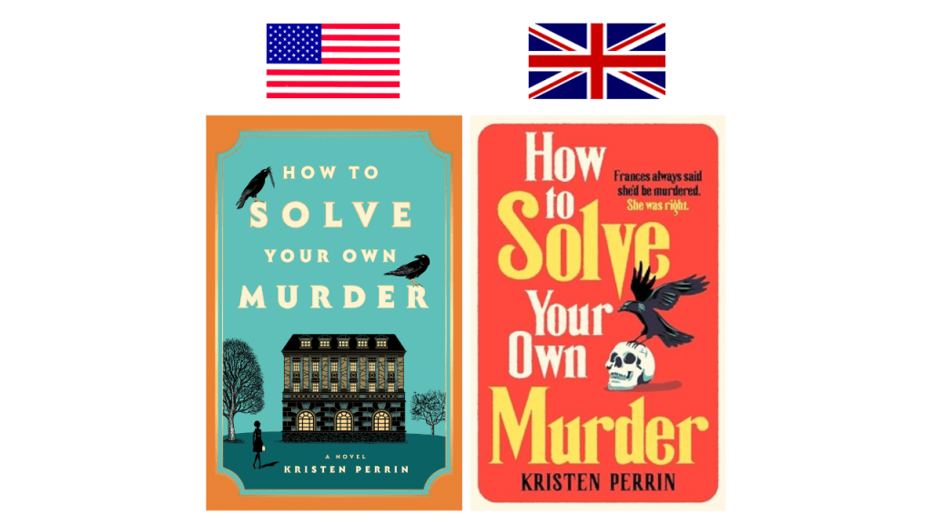
I actually like both of these covers, but it does feel like I have seen the US edition many times before. This is not necessarily a bad thing because I can look at the cover and know exactly what I am going to get from it. It screams murder mystery! However, there is something so nostalgic about the UK cover. It reminds me of mass market paperback thrillers from the 80s and I am into it!
My Winner: UK
The House That Horror Built
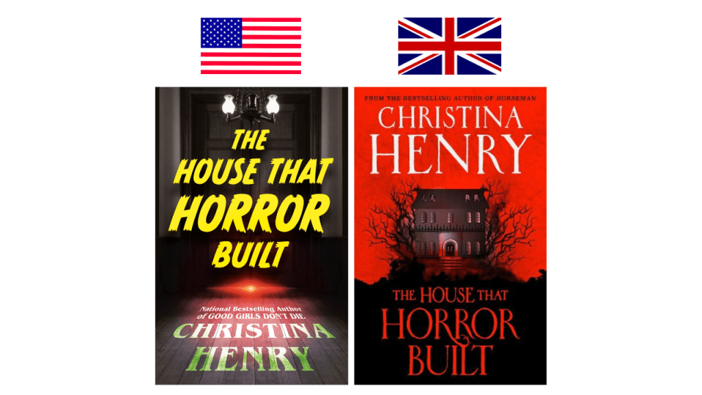
The red on the UK cover definitely pops and catches your eye, but I think that the US edition is more unique. I like the depth that we are getting with the position of the font and it gives haunted house but in a more subtle way. There is something about that red light at the bottom of the door that is simple yet effective.
My Winner: US
I tallied the votes and of the 14 books on this list, the US has won with a score of 8-6!
Let me know all of your thoughts in the comments!
YouTube | Instagram | Twitter | Goodreads

That UK with the eye on it is really not nice!!!!
I think I agree with pretty much 90% of your favorites. That eye cover though omg! Somehow, the UK cover is a lot spookier! So eye-catching (HA!!) though.
I agree! The UK one is unsettling. Love the pun 😂
I’m really interested to read Someone You Can Build a Nest In! John Wiswell is one of my absolute favorite short story authors, so I’m looking forward to his debut novel. Also, he said in interviews that the two covers captured one each of his two main characters, so I’m curious to see which of the two covers feels more appropriate to me after I read it.
Ohhh that intrigues me even more!!
I always find the difference between the US and UK covers interesting. It leaves me to ask why should there be a difference?
I often wonder this too! I know in some cases it’s because they have different publishers in the US and the UK!
I pick the same for each of these as you apart from Lady McBeth, I prefer the darker look of the UK cover. Both are really pretty
I knew that one would be divisive! Both covers are great!
I love this post! 😍 It is so interesting to see the different covers and you’ve picked ones with clear changes which I love!
Queen B is a tough one, I have preferred the UK one for the series but as the prequel has the black background instead of the bright colour, it is not my favourite one. It still effective, but there is something quite foreboding about the skull with her iconic necklace charms and tutor roses next to it on the US one. Tough choice though, I keep changing my mind! 😆
These Deathless Shores is super hard to choose too! Both so gorgeous 😍
I agree with a lot of your choices! My outcome would be 9-5 in favor of the US covers…
Oh my god that cover with the eyeball, I am traumatized 😂 what an imagery though, you’re right, definitely a book cover I won’t forget anytime soon! Love these kind of posts!
I love these UK vs. US book cover comparisons!! I just recently saw the UK cover for Murder Road by Simone St. James and while the UK cover is definitely creepy, I think I prefer the US cover as well! 😄