I love comparing US vs UK book covers because I am one of those people who judges a book by its cover! I have started doing these twice a year for upcoming releases, so all of these are coming out between August and December, at least here in Canada. The US covers will be on the left and the UK ones on the right.
Thornhedge

Normally I prefer T. Kingsfisher’s UK covers, but I have to admit that I am leaning more toward the US version in this case. One thing I have noticed is that as pretty as the UK covers are, the US ones do a better job of capturing the vibe of a T. Kingfisher story. I appreciate covers that have depth like the US cover does and the blood certainly catches your eye. There is no denying that the UK edition is stunning thought and it screams fairytale.
My winner: US
Bookshops & Bonedust
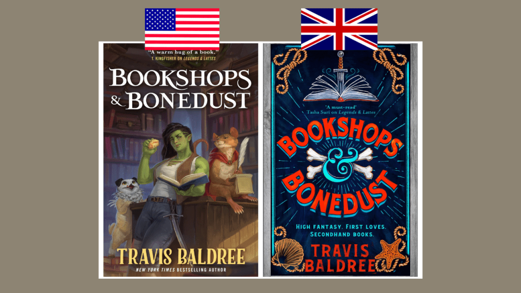
This is an easy one for me because I just love the illustrations for US versions of Travis Baldree’s books! Look how cute those characters are! Saying that, I do think the UK edition is striking and it is giving me nautical vibes, which has me even more excited to read this book. I also like the tagline on the UK cover- “High fantasy. First love. Secondhand books.”
My winner: US
A Study in Drowning

I am loving the vibes for both editions of A Study in Drowning. The US one is giving me dark academia with the desk, the bust, and the typewriter/ I love the figure of the girl and how it looks like the room is blooding. The UK edition screams Gothic with the house on top of the cliff and the pages being through off the ledge. I love the colours in the UK edition, but the illustration on the US one is just too pretty!
My winner: US
Mermaids Never Drown
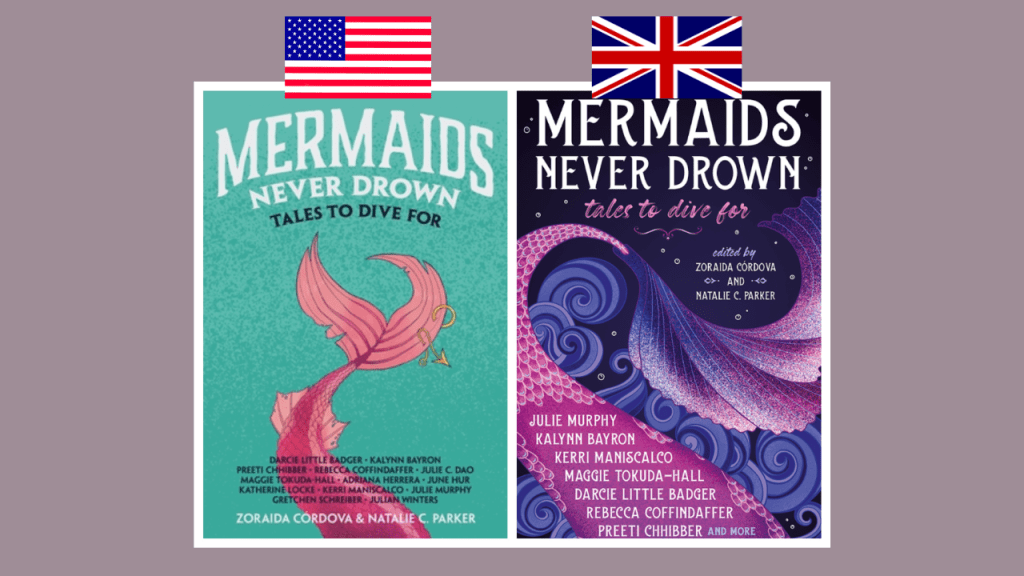
The fact that the subtitle for Mermaids Never Down is “Tale to Dive For” is everything! I am all about the aqua colour on the US cover and the fact that the mermaid tail is pink and has a fishing hook in it. I also appreciate that everyone who contributed to the collection is listed right on the cover. The tail on the UK cover is so detailed and beautiful and I love the swirls in the background. The pinks and purple are also pretty but the aqua colour is more unique. It is also a bummer that not all of the authors are listed!
My winner: US (*Why is the US dominating right now? This is unusual!)
After the Forest
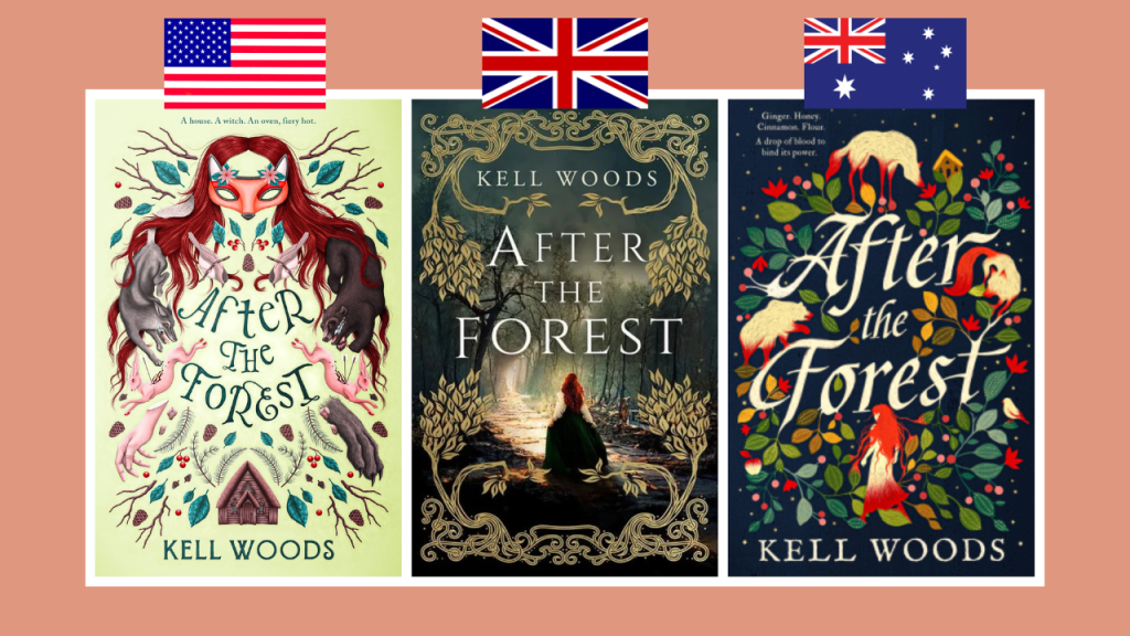
I had to add a twist when talking about After the Forest because I saw the Australian cover and it was too pretty not to share. There is something so unsettled about the US cover and I love it. It is definitely giving dark fairytale! I have to admit that I don’t love the UK edition. Something about it screams historical fiction to me though I am sure the gold will be foiled and beautiful in person. The Australian edition is so vibrant and fun! It is giving fairytale but in a different way than the US one does. I am torn between the US and Australian versions but I have never seen anything quite like the US one.
My winner: US
The Hurricane Wars
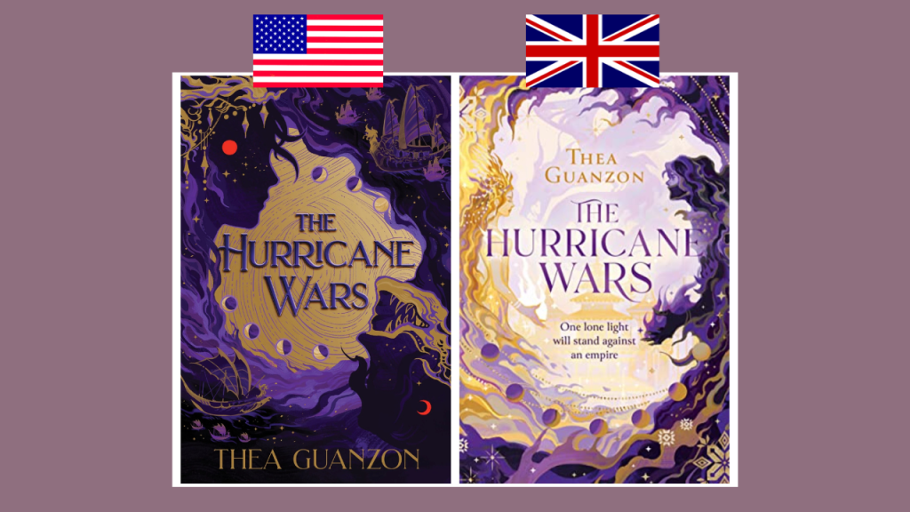
The US and UK editions of The Hurricane Wars are similar but different enough that I wanted to include them. I am into the darker tones in the US version and I am intrigued by the fact that there are ships! The UK colour palette is much more muted but still pretty. I was leaning toward the US edition until I looked closer at the UK one and saw that dragon in the background. That one me over!
My winner: UK
When Ghosts Call Us Home

Could these covers for When Ghosts Call Us Home be any different? I had to double-check to make sure they were actually the same book! The US version creeps me out but in a good way. The more you look at it, the more details you notice! What is going on with the UK cover? I like the pops of neon but other than that it is pretty generic and reads more contemporary than horror.
My winner: US
If I Have to Be Haunted

Though I think that the US edition of If I Have to Be Haunted tells you more about the book itself, my eye is immediately drawn to the UK cover. The colours are so vibrant and striking and the butterflies are gorgeous! I am contradicting myself because I often choose the cover that has the illustration of the characters but the UK one is just so pretty!
My winner: UK
Foxglove
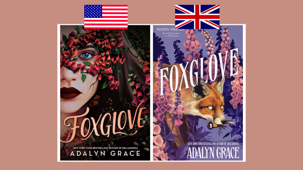
I have not even read Belladonna yet, so I probably should not be talking about the sequel, Foxglove, but the UK cover is just so good that I couldn’t help myself. Don’t get me wrong, the US edition is beautiful and I am someone who still loves the trend of a girl’s face covered in flowers, but how can you top that fox with no pupils with a bird in its mouth? You can’t!
My winner: UK
The Witch is Back

There is no denying that I am a sucker for these contemporary witchy rom-coms. There is also no denying that so many of them look the same! As much as I like the UK edition of The Witch is Back, it looks so similar to other books that fit in this subgenre. While that is something I can appreciate because you see a cover like that and you know what you are getting, the US one breaks the mould and is so beautiful. I mean she is swinging on vines coming down from the text. So pretty and sweet!
My winner: US

Medusa’s Sisters

I also include a Greek myth retelling in these posts and, historically, the UK has one because they always do these covers right, but I am leaning toward the US for Medusa’s Sisters for some reason. While the UK one screams Greek myth retelling and I love the three sisters holding the snake, the US one is more unique and I love the illustrations and it is still giving Greek myth.
My winner: US
This is so unusual, but the US has dominated this round with a score of 8-3, which I will not complain about because it is easier for me to access the US editions. Let me know if you agree or disagree with any of my choices!
YouTube | Instagram | Twitter | Goodreads

I always love seeing the different covers. Sometimes I love the not so known ones and if they are a little darker. 😆📖
I never realized how often book covers are different based on where you live! Do you know why they differ?
I think it is because they are sometimes be published under different publishers depending on the country and they design different covers! It’s definitely pretty interesting to compare them.
I think mine are the opposite to yours! I wish they would just have 1 cover so I don’t but them all!
Most of these I don’t have a big opinion on, but I agree with you that I love the illustrations on Travis Baldree’s US covers! They’re so good. I disagree about Thornhedge, though… I like the UK cover better for that one. The US cover doesn’t have any kind of fairy tale feel to me, and since this story is supposed to be subverting a fairy tale I would prefer there to be some kind of connection. (Though I do agree that it gives off very Kingfisher vibes.)
It’s always so interesting to see how different some covers are whereas others are pretty similar!
Both covers for Foxglove and A Study in Drowning are gorgeous!