I hope this post helps you find some 2025 book releases you may have missed and some new artists to follow! Let me know your thoughts in the comments!

I think that if you saw these covers next to one another on a shelf, the UK edition might catch your eye first because it is more vibrant and direct. But once I took the time to really look at them, it is the US edition that I am more drawn to. I think it is the subtlety of it that intrigues me. The two statues hugging is quietly romantic, as are the light pink roses and vines wrapping around them. It is intimate. On the other hand, the UK edition would fit nicely among other fantasy romances, which isn’t a bad thing, but it doesn’t stand out. While Tenderly, I Am Devoured is a romantasy, it is also Gothic hoor/dark academia, so I think the US cover gives you a better idea of what to expect.
Illustrators: Sasha Vinogradova (US) and Bastien Lecouffe (UK)
Winner: US
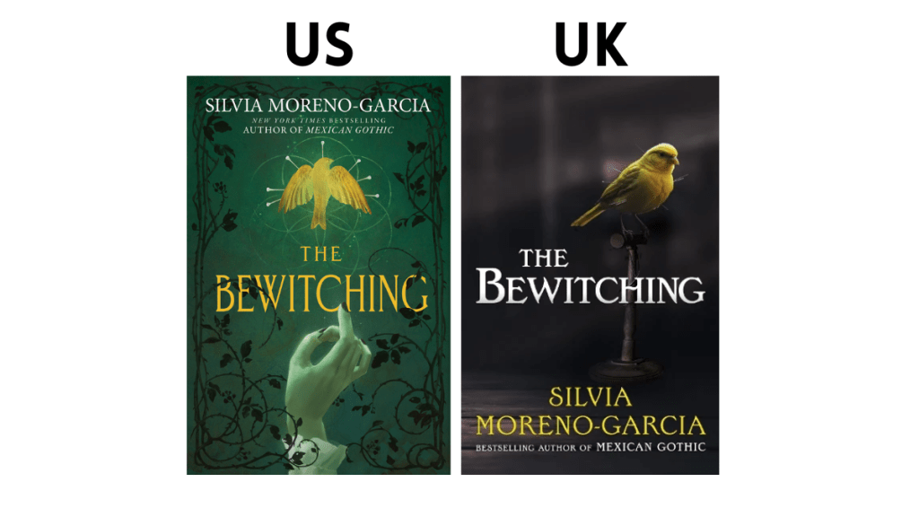
This is an easy one for me even though I am not particularly in love with either cover. I am not a fan of real people or animals on a book cover, so as pretty as that bird is, the UK cover is not something I would ever pick up. It also tells me nothing about the book itself. At least the US cover hints as something witchy with the hand and the graphics around the bird. It is moodier and a little less generic.
Illustrators: Loles Romero (US)
Winner: US
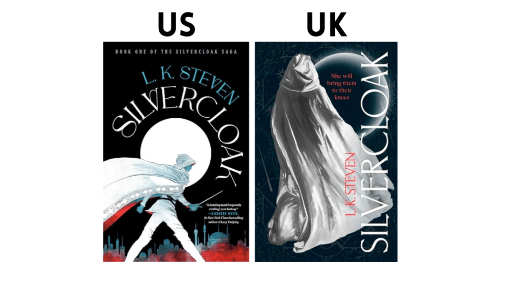
I am always torn when it comes to the covers for this series. I personally own the US covers and I adore them, but I can see why someone would prefer the UK editions. It has more of a broad appeal and I think the illustration on the US cover might seem too niche and could stop someone who might love this book from giving it a try. But that is kind of why I prefer it- it is giving old school fantasy and I love seeing that characters I adore brought to life.
Winner: US

Normally I struggle to choose which version I prefer when it comes to T. Kingfisher, but this is another easy one for me. The US edition is unsettling and that is why it works. This is a horror-fantasy and that is what this cover is giving. I also love the purple and pink tones. The illustrator, Tristan Elwell, has done some of my favourite covers- Princess Floralinda and the Forty-Flight Tower and Starter Villain, for example. I like the UK cover in theory but I think it is too simplistic for my taste and the colour palette doesn’t appeal to me.
Illustrators: Tristan Elwell (US)
Winner: US

I am always torn when it comes to Sue Lynn Tan’s covers because they are all stunning. I personally own the US editions and that will probably be the one I get for this book as well because it is more accessible for me and it is gorgeous. I love that black background and how it allows the other colours to pop. I follow both illustrators on Instagram and love their work. That said, I am leaning toward the UK cover for this one. I love the whimsical/dreamlike quality that it has. It is giving fairytale!
Illustrators: Colin Verdi (US) and Maxine Vee (UK)
Winner: UK

If I am being honest, I am not particularly drawn to either of these covers. I am not sure that I would pick up either of them at a bookstore, but I think the UK cover has a better chance. I love the tagline “to hell with love” and I think the black and white illustrations are interesting- there is something vintage about it. Also, I see that cat! The US cover is interesting in theory and I appreciate it once I look at it closer, but the details are so small it is hard to know what I am even looking at.
Winner: UK

I love the illustrations of both of these covers, though neither of them standout because I feel like they have both been done before. I am leaning towards the US cover because I think the details pop more while the tones of the UK ones are too similar and it is more difficult to see all the work the artist did. I also think the UK is very similar to Gallant by VE Schwab. I could not find the illustrator for the UK edition of this book or of Gallant, so I do wonder if they are designed by the same person or use the same stock images?
Illustrators: Abel Klaer (US)
Winner: US
I am trying to come up with something I like about the UK cover but I’ve got nothing. I think there is potential with the detailed background but it is so light I can’t make any of it out. The US gives me a better indication of what to expect. It is not something that would immediately catch my attention but I do like it the more I sit with it. The background and touches of red and blue are perfect additions.
Winner: US
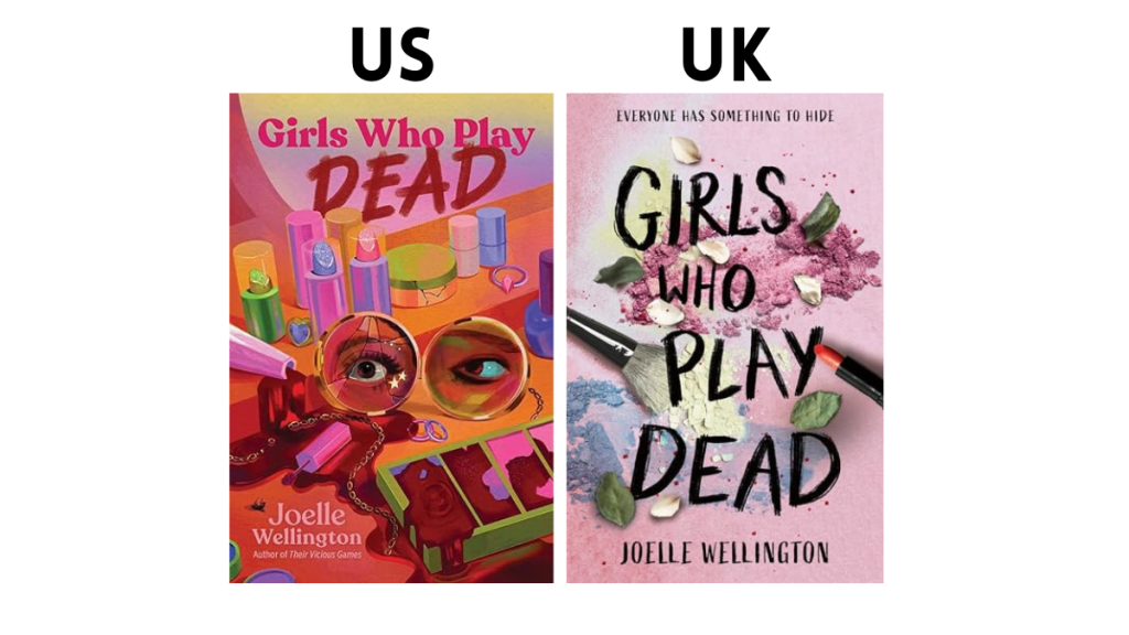
There is another clear winner for me! The US version is campy and having read and loved books by Joelle Wellington in the past, it totally fits the vibe of her stories. The UK edition is generic and looks like something from the early 2000s. I would never look at that and think it is a 2025 release.
Illustrators: Cienna Smith (US)
Winner: US

Christina Henry’s more recent covers have not been that excited to me personally, but I do like the vibes of the US edition. It looks like a horror novel from the 80s that has been read over and over again. Making the corners look worn out is a fun touch! I also like that the house in lit up in blue and the font choice really works. I am noticing that UK covers are more likely to include real photos, which I mentioned earlier just is not my thing. The maze underneath the house is intriguing though and maybe tells me more about the story than the US one does.
Winner: US

Firstly, I cannot believe I haven’t read this book yet! Secondly, I think both covers are adorable and it is fun to look at all of the little details. That said, there is something so charming about all of the choices made for the US editions. I am in love with the colour pallet. the cat dragon, the art style, and the depth of field. It truly looks like a painting and is something I would hang on my wall! The UK is cute and I love all the little creatures but it does look like a lot of other witchy/cozy fantasy covers that are out there.
Illustrators: Devin Elle Kurtz (US) and Fen Inkwright (UK)
Winner: US
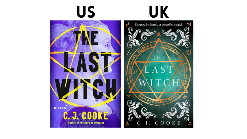
I always prefer the UK editions of C.J. Cooke’s novels (these are the editions we get in Canada!) and The Last Witch is no exception, though is was closer than usual. I think it is the colour palette that is keeping me from absolutely loving the US cover, but I do appreciate that it screams witchy historical fiction. The UK cover might not be groundbreaking but it is effective and I am intrigued by all of the symbols.
Winner: UK

I can see why someone would be more drawn to the US cover, but there is something about the UK cover that caught my eye. It can be seen as generic in some ways but it does give me old Hollywood and I love the Great Gatsby vibes of it. I bet you it is even prettier in person! The US cover is intriguing but books with people on the cover are not always my favourite.
Winner: UK
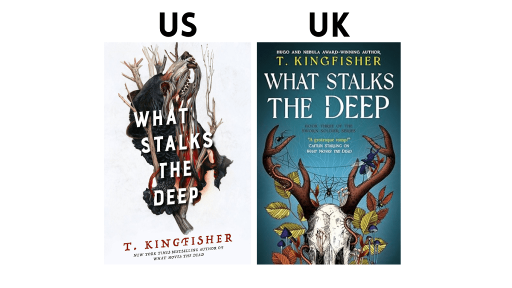
My love for T. Kingfisher is no secret and I often love her covers as well! I am not loyal to either her US or UK editions. It really depends book to book on which one I prefer. That said, for this series in particular, I prefer the US editions. There is something so deeply unsettling about them in a way that feels so T. Kingfisher. The illustrator sells prints of her original art and I have thought about buying something so many times. I know I will cave eventually! The UK cover is effective as well (I love the spider web between the antlers!) but it feels more generic.
Illustrators: Christina Mrozik (US)
Winner: US

Of all of the books on this list, this is the one I am most torn on. I think the styles are very similar and I would be happy to have either on them on my shelves. The US one calls to me because of the library and the ghostly corgi but the UK one feels more romantic and I love the stained glass window and the fact that the characters themselves are a little more detailed. The fog on the bottom half of the cover is a nice touch as well!
Winner: US
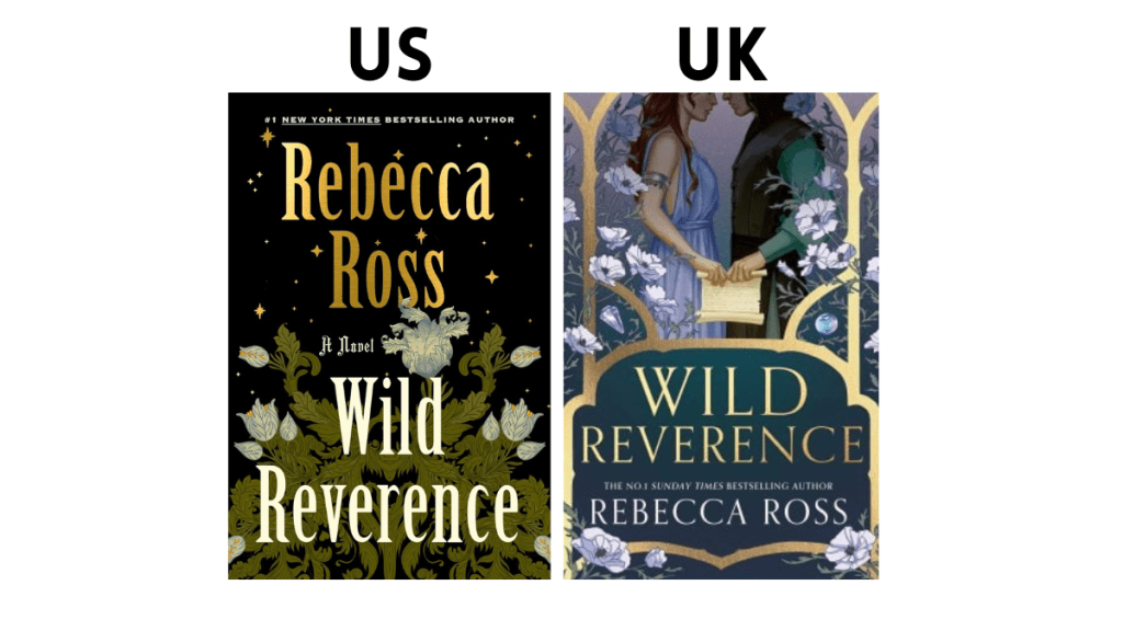
I have gone back and forth on which cover I prefer, so I will be curious to hear your thoughts in the comments. Both are pretty but also standard for the genre, though I think the UK edition is more obvious that it is a romantasy. There is definitely something intimate about the two of them holding on to the same scroll and I think the softer colour palette is romantic. There are a lot of floral covers out there but the US cover is a little different from what we usually see.
Winner: UK

My initial instinct was the prefer the US cover simply because I think it is more vibrant and draws your eye (and the French bulldog with dragon wings doesn’t hurt!). However, the more I look at them I think I would personally buy the UK edition. It is more obviously witchy and I prefer the art style. It might be a little too much purple but I like that sparkles in the background. It is whimsical!
Winner: UK

I think this will be a controversial choice because I can see a lot of people gravitating towards the UK cover- and for good reason. The illustration is so well done and I love all of the nods to the 20s, but it is giving me literary fiction and I don’t know that it would stand out among other covers in that genre. I just love the colour palette of the US cover and it has me asking for questions about the story itself- like why are there rabbits?
Winner: US

I absolutely love the US cover and followed the illustrator on Instagram and they are so talented! It is an interesting blend of futurism and retro and I think they have such a unique style. Dare I say the UK cover is giving me Sex and the City vibes- I just don’t think it stands out. It was the US cover that made me interested in this book in the first place and I hope to story itself lives up to the cover.
Illustrators: Karan Singh (US) and Jake Cook (UK)
Winner: US
My initial instinct was to go for the UK cover because I loved the details in the silhouette, but the fact that the dress on the US one is a house and that it is clear the main character is a ghost won me over!
Winner: US

The US cover just isn’t very creative though I will admit it has a lot of impact in person! I have to give it to the UK edition because it is just more detailed and I am intrigued by the illustration style. I wish I could find who did this cover!
Winner: UK
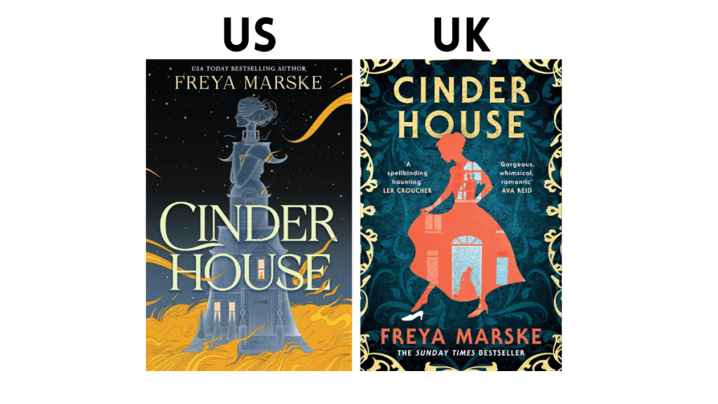
Obviously these covers were illustrated by the same person but designed differently- and I appreciate them both! I just love the comic book style of the UK cover and it is the one that would make me curious about the story itself. I am actually tempted to read this and order a copy from Waterstones if I like it!
Illustrators: Austin Drake
Winner: US
I would love to know if you agree or disagree with my choices! Or if you have any favourite illustrators. Share them in the comments!
YouTube | Instagram | Twitter | Goodreads

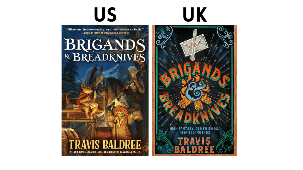
I have and love the US covers for Brigands & Breadknives and the other books in the series, but I think I prefer the UK covers. The style looks like the menu board in indie cafes, so it feels like it suits the cozy fantasy genre.
I usually prefer US covers but I’m pleasantly surprised to see so many UK editions that I love here! This is such a fun post!