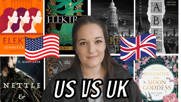
As a Canadian, I can never predict which cover I am going to find at the bookstore. We same to get a good mix of US and UK covers! I thought it would be fun to compare the US and UK covers of some 2022 covers and to choose my favourite.

I have read and loved You Made a Fool of Death With Your Beauty and I am trying to decide which cover to purchase for my shelves. This is actually the book that inspired this post because I am conflicted! The US edition is the one available here in Canada and it is striking. I love the colours and the tropical vibe- it fits the setting and tone of the book quite well. I am also a huge fan of the font! Thank said, and I feel like this might be an unpopular opinion, I find myself more drawn to the UK cover. I think it is because it is more unique. I love the pink background and the tropical nails. The wedding ring on the necklace is also very significant. I am not ashamed to admit that I loved this book so much I am open to owning both editions!
My winner: UK

This is a hard one because both editions of Daughter of the Moon Goddess are stunning, and I do own both. I bought the US version when it came out in January and I also have the stunning Fairyloot edition, which is similar to the UK one you see here but has purple flowers instead of pink. I like that the US edition has Xingyin on the cover, but there is something about the UK edition that appeals to me more. I think it is the way that the moon seems to be glowing!
My winner: UK

Not Good for Maidens is one of my recent reads and it does not come out until June, but I recommend preordering it because I loved it! I will talk more about it in a future post. This is an easy one for me. The US edition is so much better than the UK, which isn’t to say that the UK cover is bad. I just think that the US cover is one of my favourite covers of all time. This is a Goblin Market retelling and the cover captures the vibe perfectly. I cannot wait to have a copy on my shelves! I like the moth on the UK edition, but nothing about it is memorable.
My winner: US

This is another hard one for me! I have the US edition of Yinka, Where is Your Huzband? and I do really like it. I love that it includes illustrations of many of the women in Yinka’s life, especially since they are a big part of the story. That said, I think I am more drawn to the UK edition. A lot of that comes down to how vibrant the colours are. It is just more fun, and this is a romance after all!
My winner: UK

Also, look at the sprayed edges on the Waterstones edition! Stunning!

I have the Fairyloot edition of Only a Monster, and it is pretty, but I definitely prefer the US edition. The grey and red tones work perfectly together and I love the illustrations. I also think it is interesting that these editions have different taglines. The US one says “In every story, there is a hero and a monster. She is not the hero.” Love that! The UK one says “Only a Monster can kill a hero”, which is not as compelling to me. The stopwatch on the UK edition is intriguing, and I have not read the book yet, so maybe I will appreciate the elements on the cover more once I do.
My winner: US

The Ivory Key is definitely the one I am most torn on! They are both such strong covers! I love the repeated patterns on the US cover and there is something unique about it, but I adore the characters on the UK version. I am not sure how I feel about the green background though!
My winner: UK

Another hard one! There are things I love about both editions of A River Enchanted. The linework on the US edition is stunning and I love the inclusion of the harp. The UK cover has such a dreamlike quality to it and I appreciate the way that the title looks like it is flowing through the river.
My winner: UK

I thought that the Uk edition of This Vicious Grace was going to be the clear winner, but the more I look at the US one, the more that I like it! The blood dripping down the “I” is a nice touch. I love the illustrations on the UK edition, but I don’t know how I feel about the more muted colour palette. I think the vibrancy of the US edition draws my attention more.
My winner: US

This is an easy one- the UK edition of Nettle and Bone is perfection! I love all of the illustrations. There is even a chicken! The US edition is pretty, but it is a little generic. Nothing about it stands out to me!
My winner: UK

The Drowned Woods is another easy one. The US edition is absolutely gorgeous! The details in that tree are too good and I love the contrast between the background and the tree itself. I like the perspective on the UK edition and how it includes the sword in the forefront with the kingdom in the background, but it comes down to the colour palette for me. The lighter tones just aren’t my favourite
My winner: US

There could be an argument for either of the covers for Lessons in Chemistry! I like the colour of the US edition and the illustration is really cute! I love that she has a pencil in her hair and that you can see test tubes in the reflection of her glasses. However, the four blocks of the UK editions are a nice touch and I love how retro this cover looks. Also, having the “In” in the title look like it is part of the periodic table is a stroke of genius!
My winner: UK

I am not sure about this one! I love the purple background on the US cover of Notes on an Execution, but I am such a sucker for wildlife on a cover! That fox is too perfect! However, the US one is more unique and there is something eerie about it, which I like.
My winner: US

How do you even begin to choose between these two covers? Both editions of Babel are absolutely beautiful, and, obviously, pretty similar! While I really like the typography on the UK edition, but eyes are drawn more to the US version. I think that is because of the perspective and how the tower is in the middle and looks so looming.
My winner: US

Easy one! There is no debate here. The UK edition of Elektra is the clear winner. How can you even begin to compete with a cover like that?
My winner: UK

I like both editions of Gallant, and I initially thought that I preferred the UK edition because of how details the illustrations of the houses were, but I have really grown to appreciate the US edition. I think a lot of that comes down to how the book is actually packaged. The size of the US edition makes it feel more like a fairytale and I also like that the background is more of a cream vs a stark white.
My winner: US
And the winner is… the UK (by one point!)
Do you agree or disagree with my choices? I would love to know who one for you- the US or the Uk! Let’s talk in the comments!
YouTube | Instagram | Twitter | Goodreads

The UK have massively upped their cover game. As a UK reader, I used to almost always prefer US covers and I could always easily tell them apart. Now a lot of the UK covers are definitely better and they’re much harder to distinguish from their US counterparts! There are a few UK covers here that look obviously ‘UK’ to me and are weaker for it – I don’t like the font choices on UK Daughter of the Moon Goddess, UK Not Good for Maidens and UK A River Enchanted. However, there are definitely some that I really love, especially UK You Made a Fool of Death With Your Beauty, UK Nettle and Bone and UK Babel.
That is interesting. I haven’t paid much attention to the differences until recently! The UK edition of Not Good for Maidens is strange to me, especially when compared to the US cover!
Oh man sometimes it’s so hard to choose cos I end up finding both beautiful (the drowned woods and daughter of the moon goddess, for example). But then others that are a clear winners (UK version of elektra 😍). I used to always prefer US covers before, but now I find that I often times love the UK versions more, which is good since I live in Europe so english books gets shipped from the UK rather than the US. The only book I wished for the US cover was for the paris apartment since I find the UK one to be very dull in comparison to the US cover.
It is hard! A lot of them I had a hard time choosing.
You’re write about the UK edition of The Paris Apartment. It’s so generic!
Good post. I like the UK cover of Lessons in Chemistry better than the USA one.
Me too! The US one is cute but the UK one is more unique!
Love this post💜 It was fun making my own choices and comparing to yours. For the most part, we were in agreement.
I’m so glad you enjoyed it! And it’s fun we mostly agreed. I will have to do this more often!
I love comparing UK to US covers. It’s about half and half with me on which cover I prefer
Same! I really thought UK would blow the US away but it was so close!
UK publishers seem to be doing much better with covers currently (and long may it continue!)
I completely agree!
God, there are such good ones on both sides here! But there’s absolutely no contest between the Nettle and Bone covers — the UK wins by a LANDSLIDE in that one.
Right?! I had a hard time deciding with a lot of them. And you’re so right-the UK cover of Nettle and Bone is stunning!!!
Love this post idea!
And the Babel choices are so hard! I can’t decide which I like more.
That’s the one I struggled with most!
Hello there!
May I ask something?
Is there any difference between US and UK version other than the cover?
Usually I prefer the UK covers but this time with the exception of Elektra (UK) I honestly could have gone either way. Obviously everyone’s killing it with their cover game this year!
I agree. The Elektra cover is an obviously UK win but it’s such a close call for the others. I feel like covers are just getting better and better!!
this post is amazing!! daughter of the moon goddess is IMPOSSIBLE for me to choose between lol, both are just drop-dead gorgeous. the clearest winner is elektra (UK) in my opinion, it’s just so beautiful.
I love this post idea! I also have the Fairyloot of Only a Monster and Daughter of the Moon Goddess. It’s so hard to choose sometimes but some covers I definitely have a preferable favourite.
It is hard! I have noticed that is especially true this year. There are a lot of beautiful 2022 covers from both the US and the UK!
ahhh…. so many books I need to read but I loved comparing all these covers!! I think one of the hardest to decide is You Made a Fool of Death With Your Beauty… both covers are so different and vibrant. I know the UK had an indie special with sprayed edges so I may be tempted to get that one but otherwise it is such a close call for me. Other books like Not For Maidens and This Vicious Grace are easy decisions for me… picking US for both of them!! I loved this post!! 😍😍
I know! I see myself with both editions of You Made a Fool of Death With Your Beauty is the future. I am so glad you agree with This Vicious Grace. Something about the US one is striking to me!
I love the way you analyze the covers. I don’t really like the covers for either edition of Notes on an Execution, though.
Fair enough! Neither of the covers are anything special!
Well, that’s not a huge surprise. But you know, it often depends on where the book was published first. Same with book titles where a British book will get a different title when it is published in the US, and vise versa.
I’ve never liked the U.S. cover for Notes on an Execution but I like the U.K. edition. This is a great post, I never realized how much of a difference book covers can be, depending on the region.
Isn’t it interesting?! Such huge differences!
Really interesting post.
I had them about even. Great to see us both creating brilliant covers on both sides of the pond!