
Top 5 Tuesday is hosted by the wonderful Shanah @ Bionic Book Worm.
I discovered something while searching my shelves for this week’s post- a lot of book spines are boring, especially when compared their covers. I wish this were not the case considering the fact that the spine is what you see when books are on the shelf. The spines I am featuring today are beautiful but it took me forever to find five that I truly loved.

The Underground Railroad by Colson Whitehead
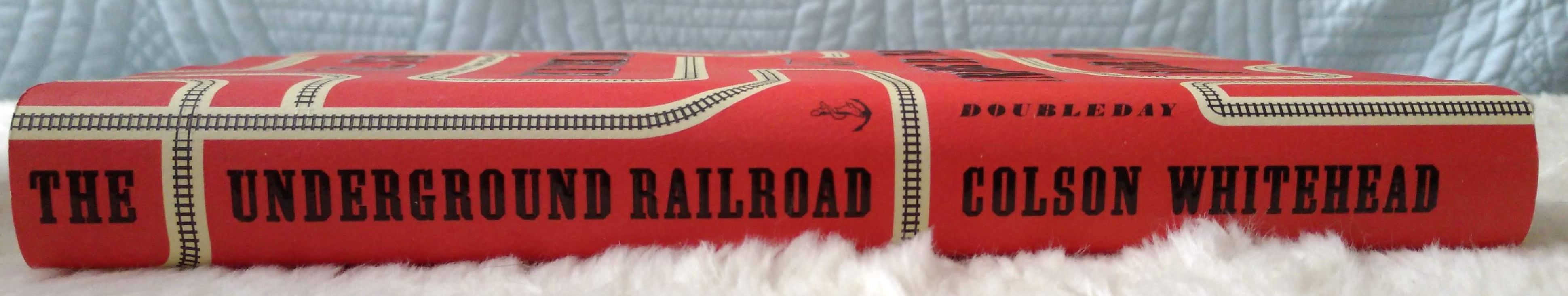
I love a red spine; they really stand out! I can think of maybe five books on my shelves that have a read spine. I love that the railroad tracks on the front cover continue on to the spine and the back cover. It gives you a little hint of what the book is about. Simple, yet effective!
The Great Believers by Rebecca Makkai

The colour scheme on this spine is completely unique and very much appeals to me. There is a magical quality to it. I love the ribbon of silver that weaves through the design.
The Queen of Hearts by Kimmery Martin

This is hands down my favourite spine because the designer took that time to create a separately graphic specifically for the spine. It is eye-catching and absolutely beautiful. Some people might find it a little busy, but I love it!
Less by Andrew Sean Greer

This spine is so simple but something about it very much appeals to me. I think it is because the way the the title of the book is orientated- there is no other book on my shelf that has the title written vertically this way. It really makes the book stand out on my shelf in a surprising way.
An Absolutely Remarkable Thing by Hank Green

This is another case where the colour combination really appeals to me. The neon green letter against the blue background really pops! It is something different from the usually black or white font colour. I also love the font type that the designer chose.

The spine of The Queen of Hearts is sooo beautiful!
Oh great post,!
I’m struck by the fact it’s surprising how many spines are boring compared to the cover when in the long term that’s how they are going to stand out on shelves.
Lovely choices:
“The Queen of Hearts” one is STUNNING!!!
ooh that Queen of Hearts spine gives me serious heart eyes! I also like the spine of The great Believers, and my boyfriend just bought that book so I get to look at it being pretty on his shelf every day now yayy lol.
Love beautiful spines! I’m reading The Girl He Used to Know by Tracey Garvis Graves, which has a pretty plain cream-colored front but a beautiful pastel-colored spine and I’m so in love with it. And great point with Less – I can’t think of any books on my shelf either with the title written vertically! Very unique.
Me too! Ah I love the sound of that. Some times the simplest designs are best.
The Queen of Hearts……. OH MY GOD!!! I need that book only because the spine is so amazing! I have no clue what it’s about, and I don’t care….. I need it!!!!
Isn’t it so pretty?! It’s an interested book too. It’s like a medical drama.
Medical drama? That would be something interesting! I’ve never read one of those lol
It’s the only book like that I have read and it was really fun!
I’ve never really thought about book spines, but these are really nice.
They are! I am starting to notice book spines more and more.
These are all so pretty! I’m in love with The Queen of Hearts 😍
Me too! So pretty.
The Great Believers spine almost has a candy like quality to it, reminds me of taffy or those giant lollypops. Very pretty!
That’s exactly it!!
I love looking at spines and the wallpaper in books:)
Me too! One of those little things that brings a lot of joy.
Great post!
What a fun idea for a post!
I really want to read Less and An Absolutely Remarkable Thing, this year. I’ve heard both books are really great.
Thank you! I thought less was really great. It is very character driven. I want to get to An Absolutely Remarkable Thing asap!
Great list! I love the spine for The Underground Railroad!
Thank you! There is something special in its simplicity.
Fun post! Having listened to the audiobook, I hadn’t realized how much the colors pop on The Great Believers cover – “magical” describes it perfectly.
Did you enjoy it? Hoping to pick it up soon. The colours definitely pop.
It was good! There are two storylines in it, one in the 80s about the AIDS epidemic, which I liked a lot, and one in the present, which is solid but not as good.
The Queen of Hearts spine is gorgeous!! x
It really is!
The Queen of Hearts had such a beautiful spine 😍💜
I know!! I wish more books were like that.
That spine of Queen of Hearts is gorgeous!
Isn’t it?! Just love it.
Queen if Hearts does have a beautiful spine!
I think my favorite spine (and dust jacket) is Furthermore by Tahreh Mafi!
That is such a gorgeous book!
Wow, The Queen of Hearts spine is amazing! It’s so beautifully designed!
Isn’t it? Every spine should be that beautiful.
Ooh lovely! I especially like the spine for queen of hearts!
It’s my favourite!
My favourite is the Queen of Hearts! Not too busy for me at all, I love anything floral and colourful and it looks gorgeous!
It seems to be everyone’s favourite! It is stunning.
Great post! Never realised the beauty of book spines until now.
Thank you! I’ve started to notice it more and more!